Crafting Custom Letter Styles: How to Mimic ::nth-letter with CSS and JavaScript
Introduction
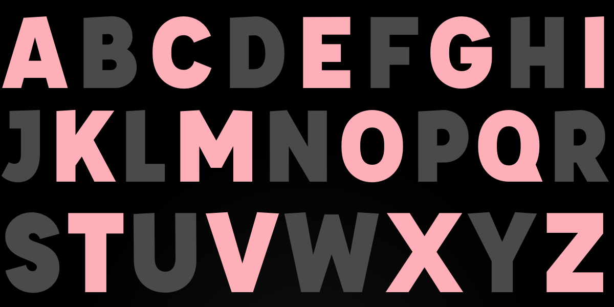
If you’ve ever dreamed of styling each letter in a heading independently—like skewing every other letter or adding per-letter backgrounds—you’ve likely wished for CSS ::nth-letter. It’s a feature that has been requested for decades but still doesn’t exist. However, that doesn’t mean you can’t achieve those effects today. With a clever mix of JavaScript and modern CSS, you can wrap every letter in its own <span> and then use CSS classes or pseudo-classes to style them however you like. This guide walks you through the process step by step, so you can create eye-catching typography without waiting for browser vendors.
What You Need
- Basic knowledge of HTML and CSS
- Familiarity with JavaScript (Vanilla JS is enough)
- A text editor or online pen (CodePen, JSFiddle)
- A modern browser (Chrome, Firefox, Safari, Edge)
Step-by-Step Guide
Step 1: Prepare Your HTML
Start with a simple element containing only text—no child elements. For example:
<h1 id="fancy-heading">Hello World</h1>This element will be our target. We’ll use JavaScript to transform its text content into individual <span> tags.
Step 2: Write JavaScript to Wrap Each Letter
Create a function that splits the text content into characters and wraps each one in a <span> with a data attribute for the letter index. Here’s a clean implementation:
function wrapLetters(element) {
  const text = element.textContent;
  element.innerHTML = '';
  for (let i = 0; i < text.length; i++) {
    const span = document.createElement('span');
    span.textContent = text[i] === ' ' ? '\u00A0' : text[i]; // Preserve spaces
    span.dataset.index = i;
    element.appendChild(span);
  }
}

const heading = document.getElementById('fancy-heading');
wrapLetters(heading);
This code iterates over every character, including spaces (replacing them with non-breaking spaces for visual consistency). Each letter now lives in its own <span> with a data-index attribute that you can use for CSS selection.
Step 3: Apply CSS to nth-letter (Using Data Attributes)
Once letters are wrapped, you can style them using attribute selectors. For example, to target every even-indexed letter (0-based), use [data-index] and the :nth-child trick on the parent, but because the spans are siblings, you can also use nth-child directly:
#fancy-heading span:nth-child(even) {
  background: #C97A7A;
  transform: skewY(15deg);
  display: inline-block;
  padding: 20px 10px;
  color: white;
}

#fancy-heading span:nth-child(odd) {
  background: #8B3F3F;
  transform: skewY(-15deg);
  display: inline-block;
  padding: 20px 10px;
  color: white;
}
If you prefer to use the data-index attribute, you can target specific indices with attribute selectors like span[data-index="3"] or combine with CSS :nth-child. The result is identical to using a hypothetical ::nth-letter.
Step 4: Add Advanced Effects (Transforms, Animations)
Now you can go wild – add transforms, transitions, custom gradients, or even keyframe animations. For a direction-aware hover effect (like Temani Afif’s demo), you can attach data-x and data-y attributes using JavaScript based on mouse position, then style accordingly. But a simpler starting point is to apply CSS transitions to each span:
#fancy-heading span {
  transition: all 0.3s ease;
}

#fancy-heading span:hover {
  transform: scale(1.5);
  color: gold;
}
Because each letter is a separate element, hover effects fire per letter, creating a delightful interactive experience.
Step 5: Handle Dynamic Text and Performance
If your text changes dynamically (e.g., via user input), re-run the wrapLetters function whenever the content updates. For performance, consider using requestAnimationFrame or debouncing. Also, wrap only visible text—don’t apply this to huge blocks of text, as thousands of DOM nodes can slow rendering. Limit the technique to headings, logos, or short phrases.
Tips for Best Results
- Accessibility: Adding many
<span>elements can confuse screen readers. Usearia-labelon the parent element or setrole="text"on each span to preserve meaning. - Whitespace: Always replace spaces with non-breaking spaces (
) to prevent collapsing and maintain visual spacing. - CSS
::nth-letterfallback: Even though the selector doesn’t exist natively, you can write your CSS in anticipation of future support by using@supportswith a polyfill (though not reliable). Stick to the JavaScript method for now. - Use JavaScript sparingly: For static text, you can pre-wrap letters server-side or during build time using a templating engine or JavaScript bundler plugin.
- Combine with CSS
sibling-index(): In Safari/Chrome, the experimentalsibling-index()function can be used inside CSS to avoid JavaScript entirely for certain cases. However, it’s not widely supported, so the JS approach remains the most compatible. - Keep it fun: Don’t overuse letter-by-letter styling—use it for impact (headlines, hero titles) rather than body text.
Conclusion
While ::nth-letter remains a CSS pipe dream, you can achieve exactly the same effects today with a few lines of JavaScript and creative CSS. The demos you’ve seen—skewed letters, color patterns, hover animations—all work because they split text into individual elements. By following the steps above, you can craft your own custom letter styling and delight your users. Now go forth and make those impossible demos a reality!